We just launched a complete renewal of our team homepage. At first glance, it may look like a visual refresh—but for us, it represents something much bigger. The previous site reflected who we were a few years ago. The new one reflects who we're becoming.
Here's why we decided to rebuild it.
Looking back at our old homepage
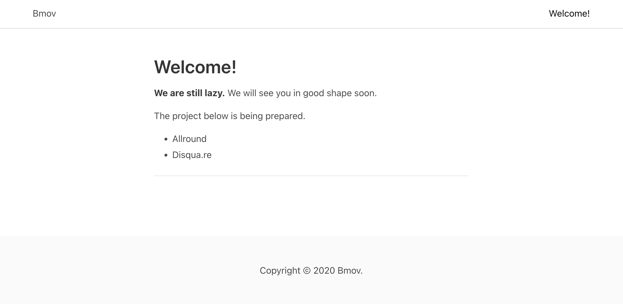
Our previous homepage hadn't been updated since 2020.
At the time, it served its purpose well. It showcased our team's ongoing projects. But as the years passed, the site gradually became a snapshot of the past rather than a reflection of the present.
Some of the featured projects had already concluded, the design had begun to feel dated, and most importantly, the homepage no longer represented the direction our team was heading.
As we prepared for a new chapter, it became clear that our homepage deserved one too.
Starting with the simplest possible idea
Our first concept was surprisingly minimal.
Instead of building a traditional website, we considered creating nothing more than a page with our GitHub organization, a few useful links, and contact information. Simple, lightweight, and easy to maintain.
The idea was appealing—but only from our perspective.
For someone visiting our site for the first time, it would answer almost none of the important questions. Who are we? What kind of team is this? What do we build? Why should someone want to work with us?
A collection of links may be enough for existing members, but it doesn't tell a story.
Designing a homepage that introduces our team
That realization changed our approach.
Rather than treating the homepage as a directory, we designed it as a landing page—a place where visitors could immediately understand who we are before exploring what we build.
Instead of leading with projects, we lead with our identity.
Each section is intended to communicate not only what our team does, but also the values that shape how we work. The goal wasn't simply to provide information, but to leave visitors with a clear first impression.
Building around our slogan
To elevate our core messaging, the new homepage features a diagonal split-screen that merges "Move Fast" and "Create Value" into a single view. Each side smoothly blends solid color fields with photography.
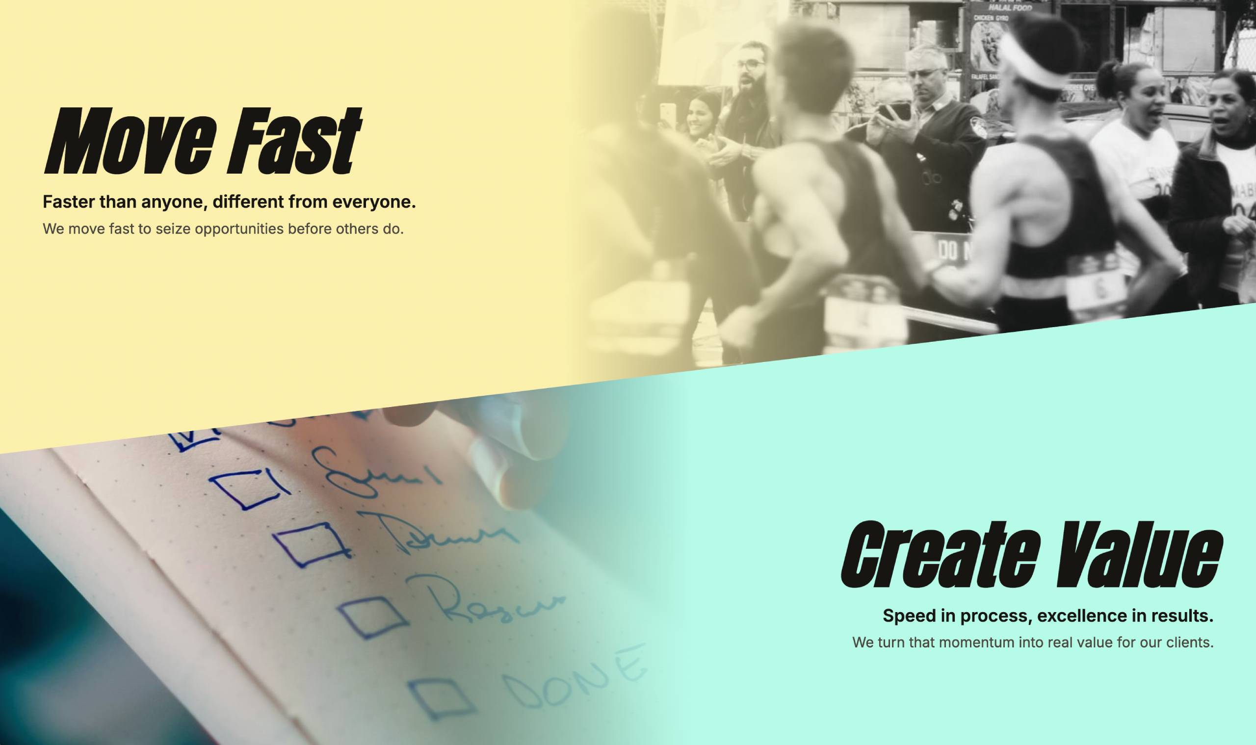
This layout adds a powerful sense of motion, visually capturing our team’s energy and direction.
A slogan shouldn't just be read—it should shape the experience around it.
With this as our north star, every design decision was tailored to support this central concept.
More than a redesign
This project wasn't simply about updating colors or replacing old content.
It was about creating a homepage that represents our team today—and the direction we're heading tomorrow.
The site will continue to evolve as our team grows, our projects change, and new stories are added. But for now, we're excited to have a homepage that feels like a true introduction rather than an archive.
After all, a homepage isn't just where people find your links. It's where they meet your team for the first time.